
"WHAT IF" DESIGNS |
I love that the Padres brought back the brown- the new uniforms are a vast improvement. My analysis:
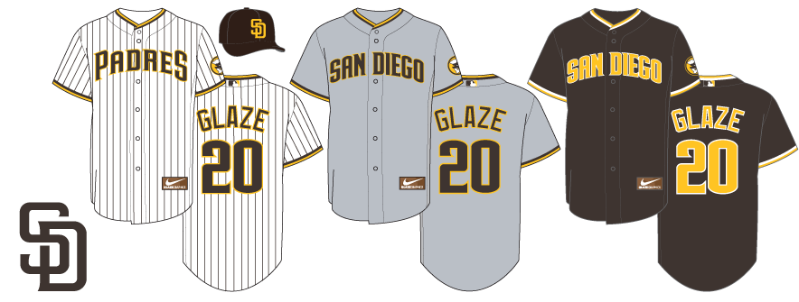
1. While I LOVE the brown road jersey, it will only be seen by people in other cities. If you made it an alternate, the fans in San Diego who have been begging for brown would actually get to see it person.
2.
The new wordmark(s) are a little odd... rounding the previous lettering makes it... wimpy. I think that keeping the previous wordmark OR creating an all-new logo would have been preferable. So I've rendered the old wordmarks here.
3. The same goes for the number and the NOB. I've shown the less-radical number font that matches the wordmark and a traditional block font that doesn't look like the Phillies.
4. Pinstripes looks weird on a road uniform. Sand does too. I prefer a classic gray road setup.
5. The brown jersey is spectacular. I've only used the old wordmark, and fixed the piping to match the other two jerseys.
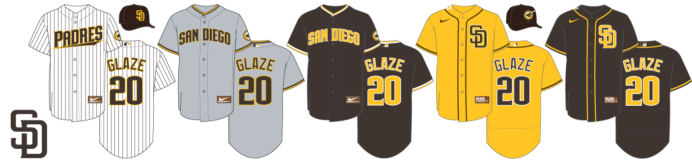
Or something like this. New hybrid wordmark, no piping on pinstripes as God intended, and a fun BP jersey 'cause... why not?
"WHAT IF" DESIGNS |

BONUS PAGES: NOTRE DAME UNIFORM HISTORY | FIGHTING IRISH UNI-TRACKER | ND UNI CONCEPTS